
CLIENT • ESR
YEAR • 2018
TYPE OF WORK • COMPETITION
RESULT • 2nd PLACE
COOPERATION • RENÉ GABRIELLI
CLIENT • ESR
YEAR • 2018
TYPE OF WORK • COMPETITION
RESULT • 2nd PLACE
COOPERATION • RENÉ GABRIELLI
CLIENT • ESR
YEAR • 2018
TYPE OF WORK • COMPETITION
RESULT • 2nd PLACE
COOPERATION • RENÉ GABRIELLI
CLIENT • ESR
YEAR • 2018
TYPE OF WORK • COMPETITION
RESULT • 2nd PLACE
COOPERATION • RENÉ GABRIELLI
CLIENT • ESR
YEAR • 2018
TYPE OF WORK • COMPETITION
RESULT • 2nd PLACE
COOPERATION • RENÉ GABRIELLI
SCOPE OF EXPERTISE
SCOPE OF EXPERTISE
SCOPE OF EXPERTISE
Visual Identity • Graphic Design • Poster Design
Visual Identity • Graphic Design • Poster Design
Visual Identity • Graphic Design • Poster Design
Visual Identity • Graphic Design • Poster Design
Visual Identity
Graphic Design
Poster Design
CLIENT BRIEF
CLIENT BRIEF
CLIENT BRIEF
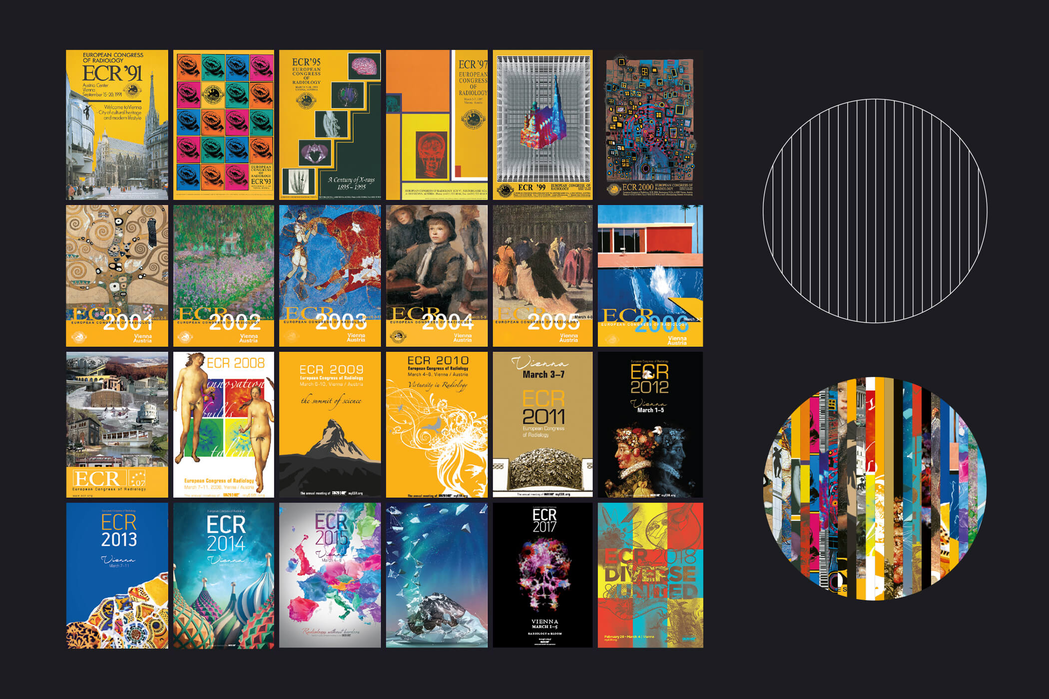
The poster should feature a large number 25 as the centerpiece. The large 25 should be made from parts of previous posters. This idea represents the history of the European Congress of Radiology and all the interlocking relationships that have contributed to building a strong radiological community in Europe.
The poster should feature a large number 25 as the centerpiece. The large 25 should be made from parts of previous posters. This idea represents the history of the European Congress of Radiology and all the interlocking relationships that have contributed to building a strong radiological community in Europe.
The poster should feature a large number 25 as the centerpiece. The large 25 should be made from parts of previous posters. This idea represents the history of the European Congress of Radiology and all the interlocking relationships that have contributed to building a strong radiological community in Europe.
The poster should feature a large number 25 as the centerpiece. The large 25 should be made from parts of previous posters. This idea represents the history of the European Congress of Radiology and all the interlocking relationships that have contributed to building a strong radiological community in Europe.
The poster should feature a large number 25 as the centerpiece. The large 25 should be made from parts of previous posters. This idea represents the history of the European Congress of Radiology and all the interlocking relationships that have contributed to building a strong radiological community in Europe.
CONCEPT EXPLICATION
CONCEPT EXPLICATION
CONCEPT EXPLICATION
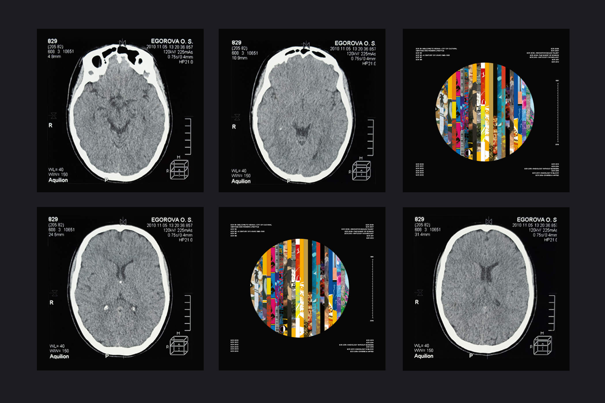
There are many paintings, so it could be easily mistaken for a brand identity of a gallery. To enhance the visual message, we chose X-ray imaging as a visual element representing a scanned area. We chose the organic circle symbol instead of a large number 25 which consist of all previous posters. The layout of the technical data of the image serves as a template for the visual layout of previous years.
There are many paintings, so it could be easily mistaken for a brand identity of a gallery. To enhance the visual message, we chose X-ray imaging as a visual element representing a scanned area. We chose the organic circle symbol instead of a large number 25 which consist of all previous posters. The layout of the technical data of the image serves as a template for the visual layout of previous years.
There are many paintings, so it could be easily mistaken for a brand identity of a gallery. To enhance the visual message, we chose X-ray imaging as a visual element representing a scanned area. We chose the organic circle symbol instead of a large number 25 which consist of all previous posters. The layout of the technical data of the image serves as a template for the visual layout of previous years.
There are many paintings, so it could be easily mistaken for a brand identity of a gallery. To enhance the visual message, we chose X-ray imaging as a visual element representing a scanned area. We chose the organic circle symbol instead of a large number 25 which consist of all previous posters. The layout of the technical data of the image serves as a template for the visual layout of previous years.
There are many paintings, so it could be easily mistaken for a brand identity of a gallery. To enhance the visual message, we chose X-ray imaging as a visual element representing a scanned area. We chose the organic circle symbol instead of a large number 25 which consist of all previous posters. The layout of the technical data of the image serves as a template for the visual layout of previous years.


NEXT PROJECT
NEXT PROJECT
NEXT PROJECT
NEXT PROJECT